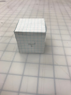
week 6 graphic designs
In this week's post the innovative box is getting an make over done to it. Of course graphic designs done to it .. giving it s new look to the design. but not just one but three designs to the box to give it more variety to the look. branding it as almost a professional trying to gain hipster's attention to purchasing your crayon box. as well as creating 3x2 crayon wrapper for your 8 crayons
These two screenshots are on the second graphic design with the pill bottle idea that to make the crayons seem like some 20mg medicine which coloring is therapy for relieving stress.
The two screenshots of the third and favorite graphic design of the box is an interpretation of cigarette box but of course the wrappers aren't cigarettes.. that would be too predictable in my opinion. Giving them just a crayon wrapper look in a hipster cool cig box just to seem like some badass person with smokes but not technically smokes..
Craft: sketching idea is all done by hand using color pencils, graphite pencil. computer application (adobe illustrator) for graphic designing of the box and crayon wrapper.
Concept: the first design was my interpretation of 90's anime race car theme, and the wrapper is based on race car stripes. The second design is based upon pill bottle since I used to take anti-depressants for my depression and felt it was therapy for me to help cope with it. the wrapper's design of the 20mg is based on the 20mg of Lexapro. except for the humorous names. I wanted to give life to the medicine that suppose to gave me much joyful life to my depressive life. The third and final design is based on a cigarette box. I thought it would give a chuckle to those who wouldn't really expect a cig box for a crayon box. but instead of a cig wrapper design for the crayons I rather have them have some interesting but humorous names to each other.. and a gradient values to each of them with wave design to it.
Composition: Started off sketching that I wanted the name design and description in the front part of the trapezoidal prism since it has a long width and the back being the non-toxic and made in sxu side detail just to be informative. now each design was made in illustrator with a layer for design and text.. each design had its on text and all design was made by shape tool and change colors.. you can have them in separate layers and lock them until finished to combine the layers into one... each wrapper are duplicated to keep the same design but different color and name but they kept their font of their box design. Each of the document had to be in 11x17 tabloid paper to be printed.
above is a initial rough sketch of the three graphic designs..
each have the implemented logo of extramundane, fonts, layout look before taking to illustrator to create.
above is the two screenshots of the first graphic design.. displaying the name in ambercolor font and Japanese kanji of the word "crayon" and 8 to include 8 crayons inside the box.. with wrapper design but changed and have 8 more color wrapper designs..
These two screenshots are on the second graphic design with the pill bottle idea that to make the crayons seem like some 20mg medicine which coloring is therapy for relieving stress.
The two screenshots of the third and favorite graphic design of the box is an interpretation of cigarette box but of course the wrappers aren't cigarettes.. that would be too predictable in my opinion. Giving them just a crayon wrapper look in a hipster cool cig box just to seem like some badass person with smokes but not technically smokes..
Craft: sketching idea is all done by hand using color pencils, graphite pencil. computer application (adobe illustrator) for graphic designing of the box and crayon wrapper.
Concept: the first design was my interpretation of 90's anime race car theme, and the wrapper is based on race car stripes. The second design is based upon pill bottle since I used to take anti-depressants for my depression and felt it was therapy for me to help cope with it. the wrapper's design of the 20mg is based on the 20mg of Lexapro. except for the humorous names. I wanted to give life to the medicine that suppose to gave me much joyful life to my depressive life. The third and final design is based on a cigarette box. I thought it would give a chuckle to those who wouldn't really expect a cig box for a crayon box. but instead of a cig wrapper design for the crayons I rather have them have some interesting but humorous names to each other.. and a gradient values to each of them with wave design to it.
Composition: Started off sketching that I wanted the name design and description in the front part of the trapezoidal prism since it has a long width and the back being the non-toxic and made in sxu side detail just to be informative. now each design was made in illustrator with a layer for design and text.. each design had its on text and all design was made by shape tool and change colors.. you can have them in separate layers and lock them until finished to combine the layers into one... each wrapper are duplicated to keep the same design but different color and name but they kept their font of their box design. Each of the document had to be in 11x17 tabloid paper to be printed.


Comments
Post a Comment